A “lucky color” is only useful if it helps you make a better choice. If a shade looks great in a horoscope but clashes with your work dress code, disappears against your skin tone, or makes your desk feel visually noisy, it has failed the practical test. The goal of this October 2026 zodiac color guide is therefore not to promise that a shirt, handbag or wall accent will change your luck. It is to give each zodiac sign a small, usable palette and a way to judge whether that palette improves how you dress, organize or focus.
That distinction matters because astrology and color psychology are not the same thing. NASA explains that astrology is a cultural belief system rather than a science-based method for predicting personality or future events; its overview of constellations and astrology separates astrological claims from astronomy. Research on color also suggests caution: color can influence perception and behavior in some contexts, but effects depend strongly on setting, meaning and culture. A review of color and psychological functioning emphasizes that the field is still developing, while later research has questioned whether some headline effects are robust.
So treat the palettes below as symbolic prompts. They are designed to be practical for October: richer earth tones, softened greens and blues, deeper reds, metallic accents and a few light balancing shades. Your best result is not “I wore my lucky color and something magical happened.” A better result is “this palette is easy to repeat, fits my real life, and gives me a clearer visual direction.”
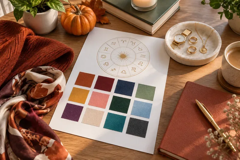
How to use a zodiac color without overhauling your wardrobe
Start small. The lowest-risk way to test a symbolic color is through an accessory: a scarf, tie, belt, watch strap, earrings, socks, phone case or notebook. If the color works with what you already own, move it into a larger item such as a sweater, jacket, dress or chair cushion. Only after that should you consider expensive or hard-to-change choices such as a coat, rug or painted wall.
A good color choice should pass three checks. First, it should work in the lighting where you will actually see it. Second, it should coordinate with at least two or three items you already use. Third, it should support the mood or function you want without becoming distracting. If a shade fails two of those three checks, change the shade rather than forcing the symbolism.
October 2026 zodiac color guide at a glance
| Sign | Primary October shade | Easy clothing use | Accessory accent | Workspace version |
|---|---|---|---|---|
| Aries | Burnt red | Rust-red knit or overshirt | Copper or red watch strap | Terracotta notebook |
| Taurus | Sage green | Sage cardigan or shirt | Olive leather accessory | Muted green planter |
| Gemini | Mustard yellow | Mustard scarf or layer | Gold-tone earrings | Yellow pencil cup or folder |
| Cancer | Soft silver-blue | Pale blue shirt or sweater | Silver jewelry | Blue-gray desk mat |
| Leo | Warm gold | Camel or golden-brown piece | Gold-tone jewelry | Brass lamp detail |
| Virgo | Forest green | Deep green blouse or knit | Dark green bag | Forest-green organizer |
| Libra | Dusty rose | Rose blouse, knit or scarf | Rose-toned bag or belt | Muted pink stationery |
| Scorpio | Burgundy | Wine-colored jacket or top | Oxblood leather | Burgundy notebook |
| Sagittarius | Deep teal | Teal shirt or sweater | Turquoise-toned accent | Teal file box |
| Capricorn | Charcoal | Charcoal trousers or blazer | Blackened-metal accessory | Graphite desk accessories |
| Aquarius | Electric blue | Cobalt accent layer | Blue glasses case or bag | Blue cable organizer |
| Pisces | Plum | Plum sweater or dress | Amethyst-toned accessory | Muted violet journal |
Aries: burnt red for visible energy without neon intensity
Aries is traditionally associated with boldness, so red is the obvious symbolic family. For October, however, a burnt red or rust usually integrates more easily than a saturated fire-engine red. It works with denim, cream, camel, black and dark brown, which makes it easier to repeat rather than reserve for one dramatic outfit.
What good results look like: the color adds definition without dominating your entire look. In a workspace, use terracotta on a notebook, storage box or mug rather than a whole wall. Research has found that red can carry different meanings depending on context; one original color-in-context study found different approach and avoidance responses depending on the situation. That is a useful reminder not to treat red as universally energizing.
Taurus: sage green for a calmer, easier-to-repeat palette
Sage is a practical Taurus shade because it is subdued, tactile and easy to combine with natural materials. It works especially well with off-white, tan, chocolate brown and muted gold. If sage makes you look washed out, move it away from your face and use it in a bag, shoe, notebook or desk accessory instead.
Change course when: the palette starts feeling dull rather than grounded. Add contrast with cream, espresso brown or a warm metallic detail instead of switching to a brighter green immediately.
Gemini: mustard yellow for a controlled point of contrast
Gemini palettes often lean toward bright, communicative colors. Mustard gives you that visual lift while still feeling seasonally appropriate in October. Use it where you want the eye to land: a scarf, sweater neckline, tote, pen cup or small art print.
What to measure: does the accent make an outfit or desk easier to read visually, or does it compete with everything else? If you keep adding yellow to “make it work,” the problem may be that the shade is too saturated. Try ochre or muted gold instead.
Cancer: silver-blue for softness without looking overly pastel
For Cancer, pale blue and silver tones create a light counterweight to October’s heavier browns and burgundies. The key is to keep the blue slightly gray rather than candy-pastel. That makes it easier to wear with navy, charcoal, denim and cream.
Workspace test: if a blue-gray desk mat or folder system makes the surface feel calmer and easier to scan, keep it. If it simply adds another competing color, return to neutral gray and keep the blue in one personal object.
Leo: warm gold for emphasis, not overload
Gold is the classic symbolic Leo direction, but literal metallic gold is most effective in small amounts. For clothing, translate it into camel, honey, golden brown or warm ochre. For accessories, metal hardware or jewelry can carry the theme more cleanly.
When to change: if the color reads costume-like, shift from shiny gold to brushed brass, camel or tan. The practical goal is visual confidence and cohesion, not maximum brightness.
Virgo: forest green for structure and visual order
Forest green is darker and more disciplined than sage, which makes it a useful Virgo color for workwear and organized spaces. It pairs with navy, charcoal, cream and brown without demanding much coordination.
What good results look like: you can repeat the shade multiple times in a month without tiring of it. If it feels too heavy, use it below the waist or in a bag and add a lighter neutral near the face.
Libra: dusty rose for balance without excessive sweetness
Libra is traditionally linked with harmony and aesthetics, so a softened rose works better than a bright pink for an October palette. Dusty rose combines with taupe, chocolate, burgundy, navy and cream and can move from clothing to stationery without looking childish.
Self-check: if the color makes your wardrobe easier to coordinate, it is doing useful work. If it only looks good in isolation, try a more neutral mauve or rose-brown.
Scorpio: burgundy for depth with practical versatility
Burgundy is one of the easiest symbolic Scorpio colors to use because it behaves almost like a neutral in fall wardrobes. It can replace black in a knit, jacket, shoe or leather accessory while keeping the look dark and concentrated.
Workspace version: use burgundy on one object you handle often, such as a notebook or pen case. If the room already contains many dark tones, switch to oxblood accents rather than adding another large dark surface.
Sagittarius: deep teal for color that still works professionally
Deep teal gives Sagittarius a sense of movement and individuality without requiring a bright turquoise outfit. It sits comfortably with charcoal, navy, camel and warm brown, which makes it useful for offices as well as casual settings.
Quality signal: the shade should feel distinctive while still matching your existing neutrals. If you need a special outfit just to support the teal piece, choose a darker, bluer teal.
Capricorn: charcoal for reliability with better texture
Charcoal can sound too obvious for Capricorn, but the useful October move is to focus on material rather than hue alone. Wool, brushed cotton, matte leather and heathered knits make charcoal more dimensional than flat black.
When to adjust: if the result looks severe or monotonous, add one warm element—cream, camel, brass or rust—rather than abandoning the neutral base.
Aquarius: electric blue in small, deliberate doses
Aquarius is often paired symbolically with unusual, future-facing colors. Cobalt or electric blue can satisfy that idea, but the best practical use is usually concentrated: a bag, sneaker detail, scarf, glasses case or desktop accessory.
Result test: if people notice the accent but the rest of your outfit still reads first, the proportion is working. If the blue becomes the only thing you see, reduce its surface area or move toward ink blue.
Pisces: plum for a softer alternative to black
Plum combines some of the visual depth of burgundy with a cooler, more reflective feel. It works well for Pisces because it can look creative without becoming loud, especially in knitwear, scarves, notebooks and soft furnishings.
Change course when: purple undertones clash with the rest of your palette. A more brown-leaning aubergine or a muted mauve may integrate better.
How should you choose between clothing, accessories and workspace color?
Use the size of the surface as your risk control. Clothing near your face has the strongest immediate effect on how a color looks on you, so test it in natural light before buying. Accessories are easier: if the shade is symbolic but not flattering, a bag, belt or shoe can still work. Workspace colors should be judged by function. A color is successful if it helps you locate things, creates useful visual zones or makes the area pleasant enough that you want to use it.
Do not assume that a color will reliably change mood or performance. Early experiments reported effects for colors such as red, but later evidence is mixed. A meta-analysis of red and cognitive performance found limited evidence for a robust overall effect after considering publication bias. In other words, personal preference, context, lighting and learned associations can matter as much as the hue itself.
What if your “lucky” color looks bad on you?
Keep the symbolism and change the implementation. You have four simple options:
- Move the color away from your face and into shoes, bags, belts or jewelry.
- Change the value: try a lighter or darker version of the same hue.
- Change the saturation: use a muted rust instead of bright red, or sage instead of emerald.
- Use the color in your workspace rather than your wardrobe.
This is one of the most important quality checks in the whole guide. A symbolic color should adapt to you. You should not have to redesign your entire closet or office to serve the color.
How to tell by the end of October whether your palette worked
Give the experiment a practical scorecard. You do not need to record every outfit. Just look for a few repeatable signs:
- Repeatability: Did you use the color at least three times without feeling forced?
- Compatibility: Did it work with several things you already owned?
- Function: In a workspace, did the color improve organization or make the environment more pleasant without distracting you?
- Confidence: Did you feel comfortable wearing or seeing the shade, rather than simply following the recommendation?
- Cost: Could you use the idea without making unnecessary purchases?
If you answer yes to most of those questions, the palette served its purpose. If not, change one variable at a time: make the shade softer, darker, smaller in area or more neutral. That is more informative than deciding that a sign’s color was simply “wrong.”
The limit of a zodiac color guide
Zodiac color systems are symbolic, not predictive. NASA’s astronomy resources distinguish constellations and the zodiac’s astronomical background from astrology’s claims about personality and future events. Likewise, color research does not support a universal rule that a particular shade will make everyone calmer, more productive, attractive or successful.
The useful takeaway for October 2026 is narrower and more practical: use astrology as a creative constraint, then judge the result with ordinary design criteria. Does the shade coordinate? Does it suit the setting? Is it comfortable to repeat? Does it improve rather than complicate your wardrobe or workspace? If yes, keep it. If not, adjust it. A “lucky” color earns its place by being usable.